Converting Images to Black and White
Have you ever tried converting a photo to black and white and ended up with a flat, dull image? Converting to black and white may sound simple, but in actual fact it requires a little more effort than simply moving the saturation slider to the left.
In this Photoshop class Karl demonstrates different techniques for converting pictures to black and white, clearly showing you how to achieve a quality black and white image with the right levels of contrast.
Karl covers methods such as the Black & White adjustment layer, Channel Mixer and Gradient Map, explaining which is his preferred method and how you can use masks to get the very best results.
This Photoshop class covers the following:
- How to convert images to black and white in Photoshop
- Black and white photography tips for beginners
- Photoshop Black & White adjustment layer
- Photoshop Channel Mixer
- Photoshop Gradient Map
You may also enjoy this Advanced Photoshop for Photographers class with Viktor Fejes, where Viktor demonstrates his techniques for converting images to black and white.
If you have any questions about this class, please post in the comment section below.
How to convert photos to black and white using Photoshop:
Method 1: Black & White adjustment layer
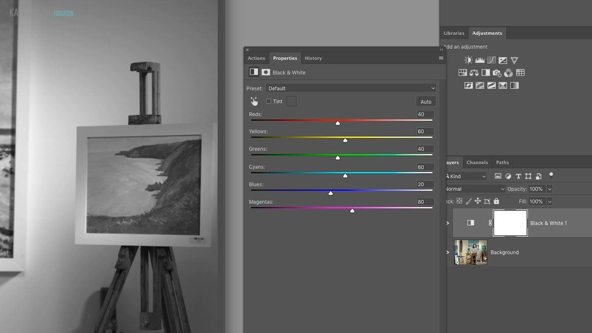
Photoshop’s Black & White adjustment layer is a commonly used method for effectively converting images to black and white.
Method 2: Channel Mixer adjustment layer
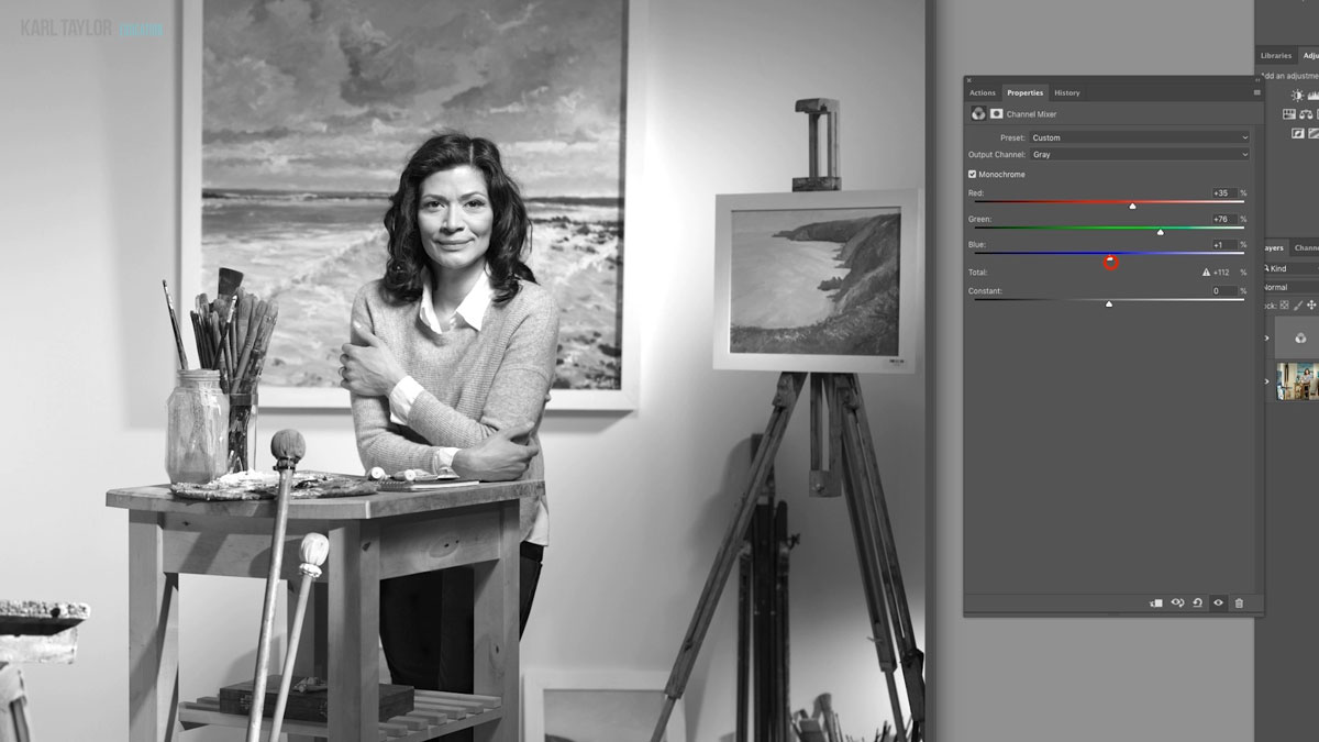
Method 3: Gradient Map adjustment layer
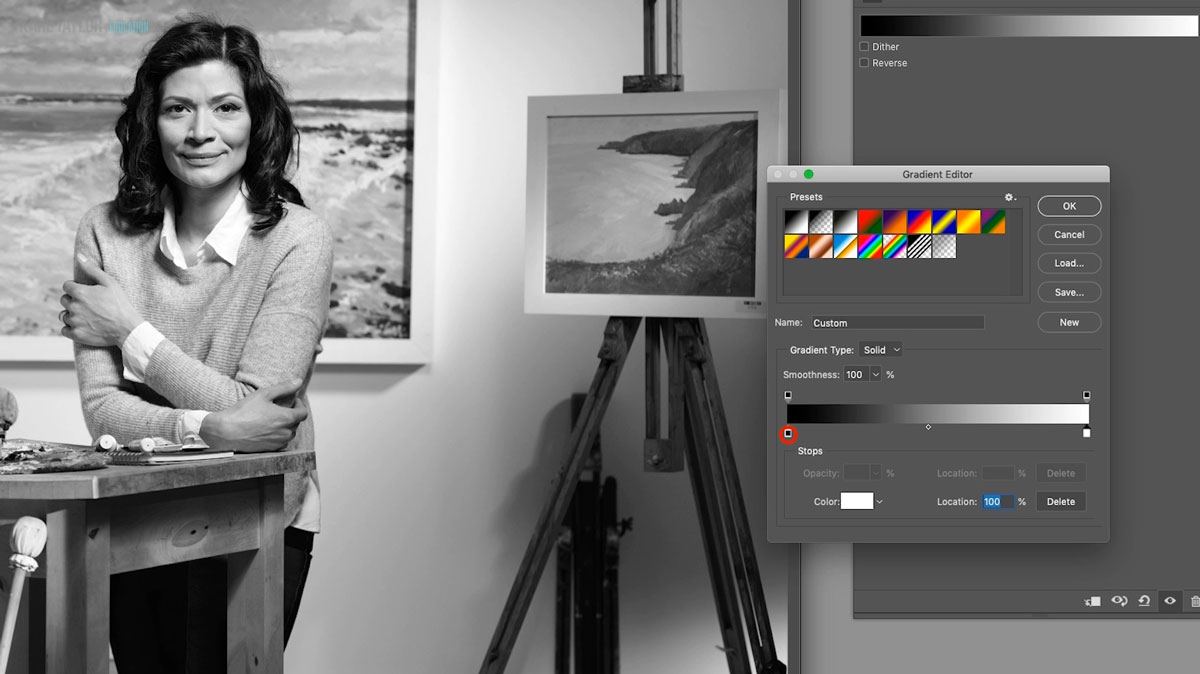
Comments
Hello Karl,
Sometimes, while shooting with lights, we may have some color shifts such as the red or a blue can look a bit more. Do you think we can use the Channel mixer to adjust it? I presume if there a shift in the red, the values won’t be zero and then bringing it back to zero will eliminate that shift? and possibly bring the overall color balance?
Thanks, Bhanu
Hi, I think the difference of the colour shift between different brands of lights is so small that you wouldn’t notice it. Also if using different brands together at the same time then the light colour balance would blend as happens even with different modifiers such as softboxes compared to silver umbrellas. The best strategy is to use a colour checker card in your final test shot and then neutralise the raw file to the grey part.
Ok. Totally understood—thank you.
I have one more scenario I’d like to run by you. During post-production, I noticed that some of my eCommerce product shots appeared slightly red—likely because most of them were taken against a white background (a solid white acrylic sheet). To correct this, I applied a Colour Balance adjustment layer and reduced the Cyan and Magenta levels. As a result, the whites looked much cleaner, and the overall colour tone felt more accurate.
Just to be sure, I used the Colour Picker tool to sample the white areas—excluding regions with shadows—and confirmed they were reading as #ffffff or 255, 255, 255 (pure white). Not only did the background reach the desired white, but the product tones in the midrange also appeared much truer to their physical look.
Would it be fair to interpret this as a valid method of achieving accurate balance in such situations?
I understand the Colour Checker Card remains the gold standard—but in unexpected scenarios like this, I’ve found this approach helpful. Your Photoshop guidance has genuinely improved my understanding and perspective on these nuances.
Would love to hear your thoughts.
With Intent,
Bhanu
Hi Bhanu, I’ll try and answer each question at a time I’ve copied your comments below:
I have one more scenario I’d like to run by you. During post-production, I noticed that some of my eCommerce product shots appeared slightly red—likely because most of them were taken against a white background (a solid white acrylic sheet). To correct this, I applied a Colour Balance adjustment layer and reduced the Cyan and Magenta levels. As a result, the whites looked much cleaner, and the overall colour tone felt more accurate.
OK but first I don’t understand why you think your product shots would turn slightly red if photographed against a white background. If the background was pure white then it would have no influence on the colour of the product. Also if your measurements showed that the neutral parts of the product were slightly red then why would you reduce cyan? You would need to add Cyan or reduce Red. In an RGB image you have curves controls and you could just pull the Red channel down abit which is the same as adding Cyan (which is the opposite of red). Magenta is a mix of Red and Blue so reducing that would only help if the readings showed the image to be too Magenta in the neutral tones. The opposite of Magenta is Green.
Just to be sure, I used the Colour Picker tool to sample the white areas—excluding regions with shadows—and confirmed they were reading as #ffffff or 255, 255, 255 (pure white). Not only did the background reach the desired white, but the product tones in the midrange also appeared much truer to their physical look.
Would it be fair to interpret this as a valid method of achieving accurate balance in such situations?
No not really as it seems you are overcomplicating it.
I understand the Colour Checker Card remains the gold standard—but in unexpected scenarios like this, I’ve found this approach helpful. Your Photoshop guidance has genuinely improved my understanding and perspective on these nuances. Would love to hear your thoughts.
An accurate quality colour checker card is the only way to check your colour balance, end of story. It is the one thing that you can put infront of a product and take an accurate reading from to decide if the colour balance is too Red, Green, Blue, Cyan, Magenta or Yellow. From there it is very easy to measure the colours and neutralise as necessary. I would not recommend anything else unless you know that in your image there is some other parts that are pure black, pure white or completely neutral. On top of all of this unless you are using a top level Eizo screen do not rely on what it looks like because your screen could be inaccurate, only rely on the colour measurements from the info pallette in Photoshop or similar software.
Dear Karl,
Thank you so much for explaining it detail. You are right, I might have complicated the process. Yes, I must invest in Colour checker to avoid any such scenarios in future.
Yes, I am using the ASUS Pro Art and it only has sRGB available. But yes, in the near future I plan to invest in an EIZO screen.
With Intent,
Bhanu.
Thank you Karl for this very useful tutorial and mentioning variety of solutions for coloured photo to b&w conversion. I would like to ask your opinion about the argue of advantage of shooting b&w by Monochrome sensor camera (such as Leica Q2 Monochrome) which doesn’t have CFA (colour filter array). In this way manipulating and converting a colour image to a B&W (by different brands of cameras) or using Film Simulation feature on Fujifilm cameras would be not necessary. Differences of tonality, dynamic range, contrasts, and specially in paper-prints for trained-eyes would be on the other hand of course. Although even in old school of analog photography and working for hours in darkroom for dodge and burn techniques we were trying to manipulate illuminating of tones and values to make an artistic image, and current softwares are considering as digital version of traditional darkroom (like Adobe Lightroom!) with same features (but much easier). However still this topic stands for Art Photography: Black & White photography with Monochrome sensor versus RGB sensor and B&W conversion in post!
Please share your technical opinion.
Hi Art, I unfortunately have no experience of the Leica monochrome sensor as I’ve never used it. It is likely if that is what it is designed for and given a brand like Leica that it has some advantages over a traditional colour sensor. However it obviously strictly limits you to one type of photography and I’ve never had any problem producing great B&W results from a colour sensor. If your only interest is to produce the best B&W images and nothing else and the professional reviews of this camera tell you that the results are superior then of course it would be worth considering but otherwise not.
Thank you for this tutorial. It’s so useful to have a different perspective on B&W printing and to be offered realistic options to achieve a pleasing result,
Thanks Sue.
GREAT SHOW VERY HELPFUL
thanks again Karl
Hi Karl. I find that the Black & White Profiles in LR are some of the best conversions around and there are loads to choose from and you can often get the look you’re after with a simple click of a button. I do however like this tutorial as it does give me a better understanding of what is happening in the Profiles and perhaps allow me to make some finer adjustments to the profiles.
Great job as always Karl. Love this site more and more.
Thank you Jason.