


Clinique Post-Production 4: Creating a White Background and Refining Water Splash
In the next part of the Clinique retouching process, Karl looks at adding additional splash elements and creating a pure white background for the image.
After adding the main splash shot, Karl works on a creating a clean white background for the image. He demonstrates a quick and effective technique for this using a combination of selection tools, the paint bucket tool and the highlight dodge tool. He then makes further adjustments to the splash part of the shot, looking to introduce further splashes and drops on the bottles and base surface.
Class objectives:
- Demonstrate how to create a white background in Photoshop
- Show how the highlight dodge tool can be used to create a white background
- Demonstrate how to add further splash elements to the shot
- Show how to include water drops on the base surface
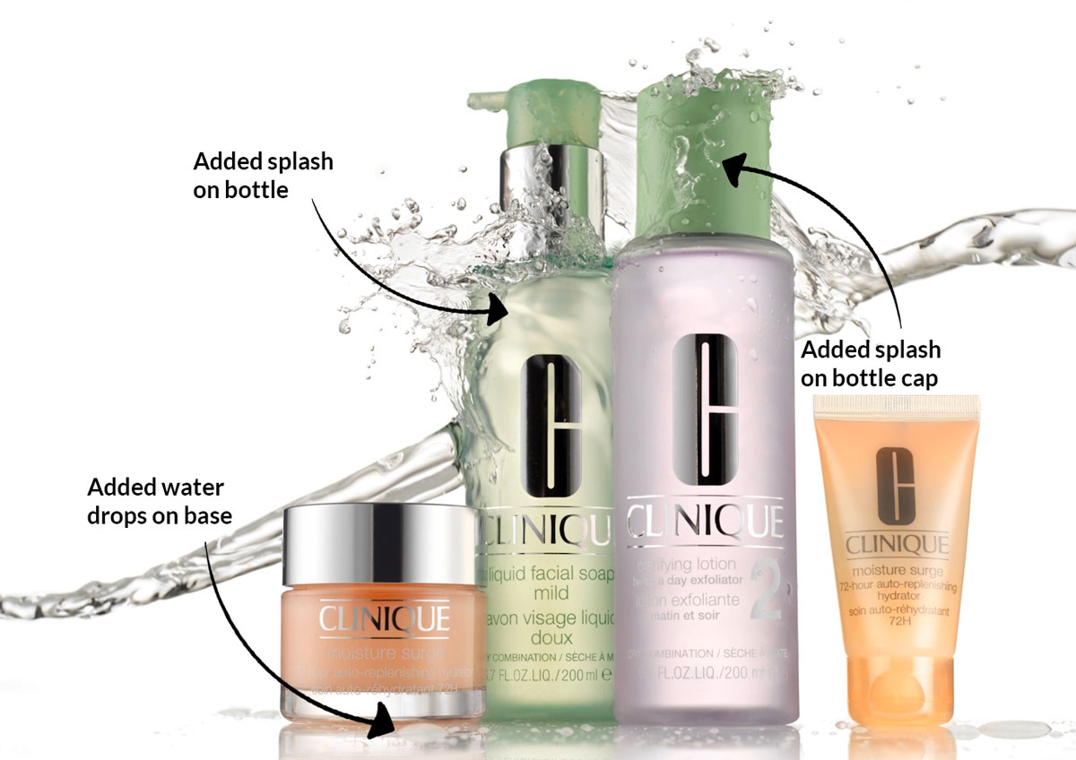
The additional splash shots and water drops.
To see how this image was shot, watch the Clinique Style Advertising Shoot classes.
If you have any questions about this class, please post in the comment section below.
Comments
If I have shadow from the product, How can i select without having harsh line and to look natural?
Hi Rafeea, I’m sorry I don’t quite understand? What do you want to do?
I photograph an object with white background and it creat shadow, in post production i did what you do in this video i fill the background with white but it fill the shadow also with whits, so I decided to select the shadow to fill the background with white without effecting the shadow with the product but it creates a sharp edges for the shadow!
Do you have any suggestions to keep the shadow looking natural with pure white background?
Hi, yes you have to use ‘feather selection’ on your selection but it sounds to me that you have not mastered the proper tools in photoshop yet? This is quite a simple thing to do but it may be that you are trying to do something before having learned the proper way. Please can you start this course from start to finish first: https://visualeducation.com/section/photoshop-for-photographers/ this will give you all the necessary skills in photoshop to achieve what you are trying to achieve.
Hi, thank for your advice.. i have learned few thinks but you are right i should start from the beginning.
I really appreciate what are giving in this platform.
Thank you.
Wonderful series, Karl. New member here.
Wondering–as there is a setting in the dodge tool for highlights that can raise near pure white values to 255 without affecting lesser values–is a similar setting for blacks (or a dark value chosen?) in the burn tool?
My experience has always been a dodge/burn 50% gray, overlay layer which is fine for the landscape work that has been my mainstay. One layer, vary brush opacity in white or black.
Thank you for such incredible tutorials. I am going to school here big time!!
Derek von Briesen
Sedona, Arizona
http://www.dvbphotography.com
Hi Derek, Thank you and firstly welcome aboard. You have some beautiful work in your portfolio, some of it reminds me a photographer Gallen Rowell, sadly since passed. I remember having one of his books when I was younger, unfortunately I don’t know where its gone.
What a brilliant idea having some sort of limiter on the burn and dodge highlight or shadow tools, that should be achievable as it’s all mathematical but there is nothing like that. If I speak to any contacts at Adobe I will pass that on though. Your method with the 50% grey overlay works just fine but you are then stuck with burn and dodge on one layer, the advantages of multiple curves adjustment layers is each one can be for either burn or dodge and for specific areas at a time allowing you to look at the image with fresh eyes and potentially adjust the opacity of a given layer if you think you went to far. I look forward to any further comments or questions. Kind regards Karl.
Thank you, Karl, for taking the time to reply so immediately. And for your kind comments on my work.
When deciding on a subscription, obviously your talent–the creative imagination, immense experience, extraordinary craft–were key factors.
But more so, your generosity as an educator is so apparent in your interaction with your subscribers. Not rare, but less than usual online. When one finds such a level of expertise, with that kind of generous spirit, it’s a graduate studies program with the best professor around!
I am really looking forward to seeing a live presentation.
A 50% gray overlay for fine for landscape but for the precision/specificity required in products I can see that dedicated dodge and burn layers are an absolute must.
As well, I can see a disciplined workflow of naming all layers with a real degree of granularity will save lots of trouble!!
As for Galen Rowell, he was and is still greatly admired. A groundbreaking landscape photographer and also an incredible human being. An artist and a teacher.
Lost too soon in 2002.
There’s a really fascinating article about the early controversies surrounding the use of Adobe Photoshop to manipulate photography. In an old school piece of longform journalism, published in Atlantic Magazine in 1997, Kenneth Brower profiles the different approaches of Galen Rowell, the purist, and Art Wolfe. an early and creative adopter of PS.
As the writer, he takes no sides. But it’s a brilliant piece of writing, almost seems a bit quaint these days and in so many ways, it’s long past controversial.
You can find it here:
https://www.theatlantic.com/magazine/archive/1998/05/photography-in-the-age-of-falsification/377107/
The story of Rowell’s relationship with the Dalai Lama that led to his famous rainbow shot of the Potala Palace in Tibet is worth the read alone.
Thanks Derek, I’ll check those out.
Hi Karl,
I was wondering why I haven’t seen you use the Bron Cumulite? Is it simply because you don’t have one in the studio or do you prefer using something else for an overall even light, especially from the top?
Thanks, Joe
Hi Joe, the Cumulite is a lovely piece of kit. I don’t have one, I don’t think born do them anymore. I’m not sure how much use i’d have for one though as most of my softbox work is with them behind scrims for gloss surfaces and where the softbox isn’t reflecting off of a gloss surface then I don’t think the perfect homogenousity wouldn’t really be necessary
Hi Karl. Curiosity, when you set up the backlights to be close to white 255…. had you gone a little higher ….. would it help you later to get pure white?
Would it save you time and you wouldn’t have to do dodge so much?
Hi, Yes you can usually go over and in this case it wouldn’t have been a problem, I usually anticipate that the light I’m adding on the product will also add a small amount of light to push the background from around 250 to 255.
Thank you. I’m having to produce something at college in the style of the Clinique shoot so I’m meticulously working my way through everything.🤔
Actually I think I probably know the answer, you used the barn doors to create gradient so that the water showed up better and now you are cleaning up and putting the background back to white?
Yes
Hi Karl. The grey areas that you are removing in the corners on the white background, was that because you used barn doors on the backdrop lights please to create gradient?
Hi Maxine, and yes again 🙂