
Creative Ad-Style Perfume Photoshoot
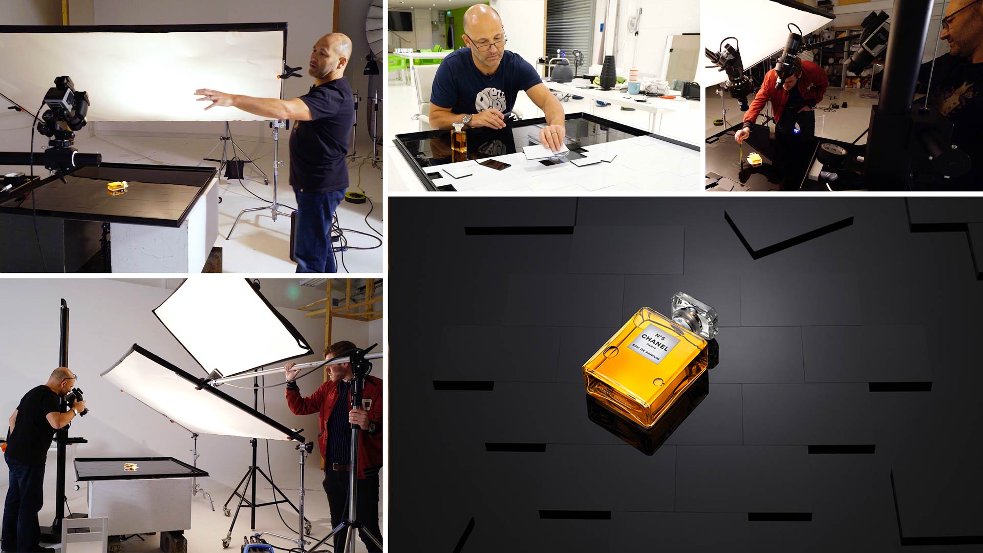
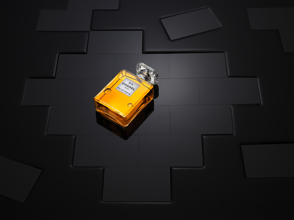
In advertising, perfume is often portrayed in ways that evoke a sense of elegance, class and style. After creating a simple yet elegant advertising shot of a bottle of the classic Chanel No. 5 perfume, Karl creates a second luxurious image.
Building from the ground up to create the desired lighting effect, Karl then demonstrates how, with creative thinking, it’s possible to achieve a number of different images with just minor adjustments.
This product photography class covers a number of precise lighting techniques that are needed to capture this stylish image as well as some stunning modifications to provide a few inspirational ideas for your own photography.

In this product photography class we cover the following:
- Product photography: How to photograph a perfume bottle
- Product photography tips
- How to use multiple studio lights
- Lighting setups for product photography
- How to photograph liquids
- How to creatively use the same background for different images
Comments
Hi Karl,
Can you tell me what size of the Black Acrylic Tiles?
Hi, I think I had them made at about 9cm x 4cm. With any of these things I would consider the product you are going to photograph and it’s size and then cut out some paper templates to scale to work out what will look good.
Hi Karl, hope all’s well. I have a question about the black acrylic and the clear shaped piece fixed into it. What do you think about having a larger clear acrylic piece in the middle of the black acrylic sheet in the shape of a rectangular or square, and then cut a piece of black paper to stick underneath it, based on the shape of any specific product? It could then perhaps be used for more projects? Could this be a workable option? What are your thoughts?
Hi Mark I hope you are well too. Yes but that’s exactly what this is, it’s a large tray with a clear rectangle underneath big enough for large bottles etc and other projects. But I needed to make a tiled looking surface so I had the blocks cut to look like that and make the shape. You will see me use this tray for other things in our classes too.
Amazing Shot Karl.
Hi,
What is the size of black acrylic tile please
Hi Jamieha, they are 10cm x 6cm 🙂
Hi my favourite size is 1.2m x 1.2m.
Hello Karl
The lighting is beautiful but there total overkill with Photoshop with the water shot and bricks spacing
Such manipulation in Photoshop is not photography. It is misleading
…..
The bricks should have a very slight bevelled edge or rounded off to give you the effect of spacing
Easily done with fine sand paper at 45 degrees ( I made rig to do this )
…
Instead of water, why dont you use Glycerine?
Viscosity gives you surface tension and easier to control its flow
….
To clean surfaces, always use Naphtha (lighter fluid) because it evapourates without a residue. I use it in all my lens and camera repairs!
Never use Methylated Spirit on acrylic or painted surfaces!
….
Hi Raj, Many of my classes feature no or very little PS work but it is completely correct to say that Photoshop and even CGI are part of today’s professional image production world, which is why we have a whole section dedicated to educating people about it. From a client’s perspective how you get to the result isn’t that important, only the result is important to them. In answer to some of your other comments; I didn’t want beveled edged blocks, Glycerine gives you viscosity but it also gives you a lot of mess to clean up in between each take, Methylated spirits works better than any other product I’ve ever tried on glass or acrylic. Finally the style of your comment here indicates that you have a master level of knowledge and that through them they it seems you are implying that your way is the only way and the correct way? Is that what you are trying to say or is it simply a translation misunderstanding? Kind regards Karl.
Karl, you are my hero.
You are a legend my friend when it comes to light. You are peerless. No question.
I am a no body, a grumpy old cripple in a wheelchair since my motorcycle accident in 2016
You totally misunderstood me.
I apologise unreservedly for any confusion.
Unfortunately I have you at a disadvantage
I supply Pentax 6×7 and Mamiya 6×7 equipment to a number of pros in fashion including from agencies like CLM and LGA. I also service cameras and lenses for many (used Naphtha to clean for past 35 years!).
Prada, Hermes, Dior, Drakes, Burberry, Ralph Lauren, Nike are few examples of brands that have an “unofficial” non digi policy since October 2018. Most their campaigns are shot on film.
…..
Hence I must respectfully disagree strongly that Photoshop and CGI are part of image production world.
There is also very serious legal implications in respect of “misrepresentation” and “passing off”
This partly led top brands to switch back to film
….
You have massive skill. You are more than capable to do shots in camera.
You do one light challenges.
But why dont you do “no Photoshop” challenge?
Or “film” challenge?
…..
I love you big man.
Maximum respect always.
Hi Raj, I understand what you mean and thank you for the clarification. However there are many brands that are perfectly accepting of post production work so it is necessary for us to teach these elements in a multi-disciplined platform such as ours. You will find many live shows where I accomplish the best result possible in camera and I hope you enjoy them. Just let me know if you have any questions.
Isn’t all product photography manipulation of some sort? When using any additional lighting, that’s manipulation. It’s all about what the client expects, and what is possible to deliver. So photoshop and lighting, even lenses, all are in the same mix. Just my opinion in case the Photoshop police are close by.
Hey Karl.. not quite sure where to ask this question other than here. If there is some other place I should ask.. just mention it.
It doesn’t have to do with this shoot. You have a top down shot on your website of a Prada bottle set in a hole of some kind of powder. I’ve seen shots with this type of powder in various ways, some in different colours, but usually white or light gray. The powder has a consistency like cement powder or some makeup powders where it seems to hold its shape. What is that powder?
Hi Gary, I will email you the answer as we don’t make all of our info available in this public visible forum. Some of it is just for members.
Hi Karl,
what can you recommend as an alternative to broncolor Picolite Projection Attachment? Unfortunately broncolor is no longer available. I have a Profoto flash system, but there is currently no suitable attachment.
Kind regards from Hamburg, Germany.
Jan
Hi Jan, the Picolites are still available to my knowledge? I’m not aware of an alternative for Profoto I’m afraid although I’ve heard there are some independent brands attachements.
Dear Karl and team,
I’m new here and I have just fallen in love! You are a powerful team with a wonderful master.
Thanks again for this amazing learning experience.
Best regards from Roma, Stella
Thank you Stella, glad to have you aboard. If you are interested in lighting then I’d say it’s important to watch the first 8 chapters in this section 0 https://visualeducation.com/section/lighting-theory-and-equipment/ if you have any questions let me know. All the best Karl.
Great stuff. Am glad am here once again
Once again a great show.
Really like the way you take us through all steps one by one, and not missing to mention smallest of details.
Since ( since is hardly 2 months ) I have joined KTE, have learnt great deal of information about lights, lighting and photography overall.
Thanks Karl for putting together all the information.
Thank you 🙂 ?
Thank you Karl for this great course! I’ve recently joined and I hope to learn more of these courses.
Thank you Abdullah, we hope you enjoy your time with us. I would also recommend watching the first 15 chapters on Lighting as this helps people the most with concepts they may not have been aware of – https://visualeducation.com/portrait-photography/#lighting-theory
Hi Karl,
as always great explanation, being attentive to every little detail and of course superb results!
At the end when you used the knives to create the waves in the water I was wondering why you don’t drop some water (really only some tiny drops for not creating a mess on the bottle) or using a hairdryer from different direction to create the effect?
A hairdryer directly from above I could imagine a very nice effect on the surface of the water.
Regards from Italy!
Oliver
Hi Oliver, I think we’ve shown air cans for disturbing the water, most often though we find hands work best as in this shot https://karltaylor.com/g1u5wfgbet8kj52a51jwocz9maugt9
I recently saw someone painting a transparent acrylic sheet black and realized – that would be perfect for creating the window used here. Just mask out the bottle shape and spray paint the rest of the transparent sheet black.
Totally waterproof and a lot less work, will try this soon.
Hi David, that seems like a good idea. It’s just that I use mine for a variety of other products such as bottles too. I can just mask around with black tape and then don’t need to buy more sheets.
Ah, of course, thanks for that thought! I will make a bigger window and instead mask it when needed.
Great Work ! As the standard black and while surfaces get more common, I see this type of solution endless in giving new design looks. Thanks for sharing.
I’m glad it’s not just me that likes the smell of the cleaning alcohol 😀