
Perfume Bottle Photography | Post-Production
Following on from Perfume Bottle Photography, Karl sits down to review his work and make the necessary post-production adjustments needed to finish off the RAW image.
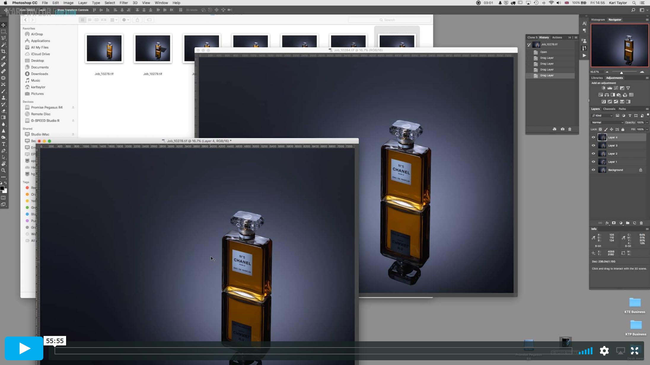
In this class, he applies a number of commonly used Photoshop techniques well suited to product photography. In addition to explaining why we use these tools and demonstrating how to correctly apply them, Karl also shares a number of useful tricks that can be used to enhance an image.
From using the clone and brush tools to rectifying image distortion, this chapter covers a number of Photoshop techniques that can be applied not only to product images, but to all genres of photography.

In this class:
- Post-production techniques for product photography
- Common Photoshop tools and how to use them
- How to create composite images in Photoshop
- Establishing an effective post-production workflow
- Layers and layer masks
- Keystone Effect: Correcting image distortion
- How to effectively use burn and dodge
For more on the concepts covered in this course, go to Post-Production section.
Questions? Please post them in the comments section below.
Comments
Incidently, Karl, are there any tutorials you can recommend in which you show how to deal with banding of the gradient especially for a shot like this in photoshop?
Hi yes that is covered a couple of times in our post production section in a couple of classes, if I remember correctly this is one of them: https://visualeducation.com/class/practical-demonstration-on-business-retouch/
Thank you very much for the reply, I will check out the link for sure!
Amazing tutorial Karl, you’ve inspired me to try my hand product photography (as im mostly a food photographer) but im really inspired to try a perfume bottle shot.
That was very interesting to watch. I found you work very much as I do in photoshop in many areas but you do several things from which I would normally stay away. The painting.. I would clone places to smooth out areas, but I usually don’t cross that line about spraying in colour. It illustrates what you said in another video where you think of the image as pixels and not as the product.. you are just shifting pixels to get to an end result. I found that quite eye opening. Often I think the real object is a little too sacrosanct to transform. There were a few other approaches as well where I picked up little points. Good to see another person’s approach.
Watched the whole thing from shoot to post. Learned so much, amazed at your knowledge and skill.
Thank you.
Thank you so much. Hope you can join us live with Rachell Smith today!
great, thank you very much. i tried it on PC.
work with ‘alt’ key.
when you work with the brush tool in photoshop on the screen, how you sample a color in a fast way without going out from the screen to the tool box ?
Hi, if you have the brush tool open you press ‘option’ key on a mac and that turns the brush tool into a colour picker tool temporarily and then when you release the key it’s the brush tool again. Learning the keyboard short cuts for Mac or PC for photoshop really helps speed up your workflow, they are available as a list from Adobe’s website.
Great postprocessing tutorial. Liked a lot also the interactive analysis of the product and the explanations of what was working and what not, with the practical application of many PS tools to improve the image.
Thank you Enrico.
Even though your quite the perfectionist, it was quite surprising to see how much post production you do… Good video btw!
Hearing your thought process as you develop a picture is the real value I find that separates you from other training videos, thanks again for the quality of work you put out
Thank you Raul.
In your reply to Gustova Bird, could you elaborate, just a little or as simple as you can, on the “key physics principles that are set in stone…”? I’m in the medical field and there are a lot of physics in this field so im aware that light reacts differently depending on what angle it’s hitting an object but Photography is a different challenge for me as far as light goes. Knowing how light reacts in Photography is everything to the photo. Just wondering if you would enlighten me or if it’s easier, give me some topics on the physics to google? You really are a master at knowing light Karl.
Great videos! Great tip with the polarizer. Liked the iPhone torch idea too. I’m wondering if a little “sparkle” could be gained back-lighting the liquid with directional light (from the rear instead of the top) maybe a black foam core “house/cover” for the dark bottle edges/ contrast? Or is it just too hard to get the liquid color to pop without the gold/white paper reflector shapes in back?
Hi Gustavo, every situation and every shape of bottle presents its own challenges and opportunities. It is difficult to say what will work precisely I can only show what I do through experience given each situation. My overall techniques are similar on liquid and bottles as there are some key physics principles that are set in stone but even the bevel edge of a Chanel 5 bottle gives a different refraction to say a Dior perfume bottle. As for lighting through the product this is a technique I also use but it wasn’t going to work on this one given my shooting angle.
What’s the monitor you’re using?
Hi Kevin, I switch between different monitors but I was using a Wacom Cintiq which is actually a tablet. I also use an Eizo.
This shoot and retouch may just be one of the best tutorials I’ve seen. Thank you Karl.
Thank you David.
Karl would it have helped to put a strip of gold reflective paper just for the bit that goes under the bottle and leave the rest of the card white? Essentially take the same shape card you cut out but just stick on a strip of gold to the bottom of it over which the bottle sits and maybe extend out just a little bit more.
Hi Gurushankar, yes that could have worked. Always good to try a few things and test the results.
Very nice tutorial Karl.