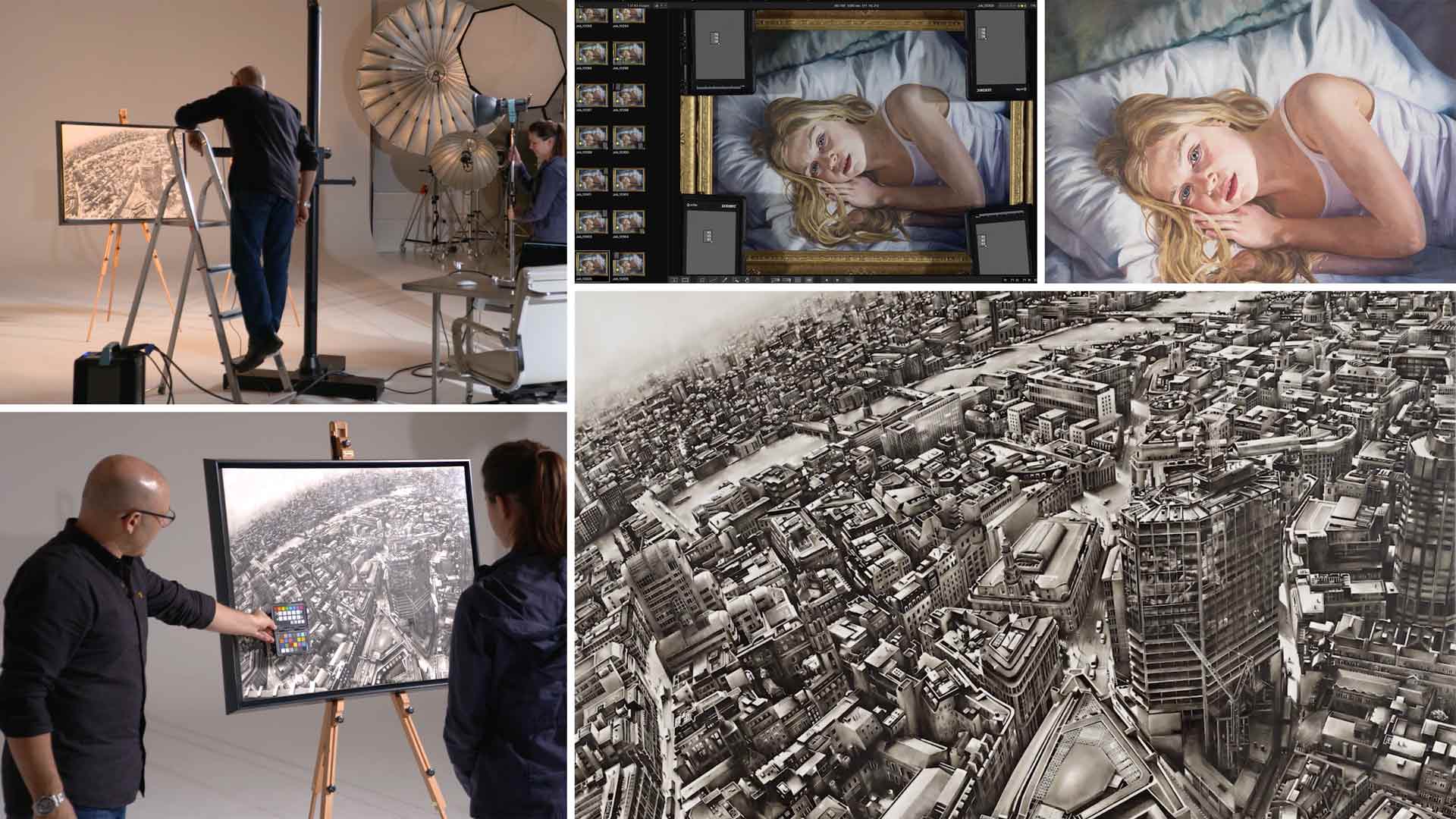

Photographing Paintings for Reproduction
In this class, Karl is commissioned to photograph two paintings for artist Louise Lawton.
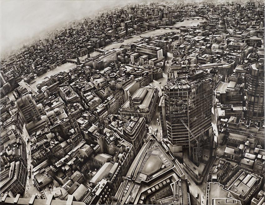
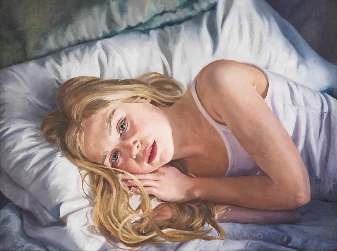
Photographing the two pieces, one being a large monochromatic piece and the other a smaller colored image of a young girl, Karl explains how to overcome common challenges associated with photographing paintings.
From the basics of how to position the painting to more complex elements such as light ratios and lens choice, you’ll learn all you need to know to photograph paintings, including how to minimize lens distortion, reduce reflections on lacquered surfaces, set up your lights and ensure true colour accuracy.
In this class:
- Product photography: How to photograph artwork
- Lighting setups for photographing paintings
- Lens selection for photographing paintings
- How to avoid reflections in shiny or lacquered surfaces
- Where to focus when photographing a painting
- How to achieve color accurate images
Questions? Please post them in the comments section below.
Comments
Hi Karl,
On full frame camera like Nikon Dslr what will be the ideal color temperature to shoot paintings ?
also if the painting has got many layers and texture on it what light modifier will be ideal ?
Hi Siddhesh, it should always be the colour temperature of your lights. If you are using studio flash then this will be about 5600K. To understand which modifier is best and the technique then you need to watch this class: https://visualeducation.com/class/angles-of-incidence-and-reflection/
Hello Karl,
Thank you for this lesson, very useful and in-depth information indeed. Could you please explain why you chose standard reflectors as light modifiers and not softboxes or diffusion material? Is there any benefit to hard light for shooting artworks? Thank you in advance.
Hi Anna, it depends on the material texture that you are photographing. Generally yes the harder light provides better crispness and saturation for flat items. On some oil paintings or materials with heavy texture or depth then it would be too hard and you would need to move to softer lighting.
Hi Karl, how would you go about shooting a very tall and narrow painting for instagram etc.?
Hi Molly, I don’t understand the question? I’d shoot them similar to this with the camera in vertical format and then transfer the images to my phone for posting on Instagram?
Yes the paintings I want to shoot have a 5:1 height to width ratio. How would you with the background?
Hi Molly, I’d probably opt for a piece of black velvet hanging behind the painting so you’d end up with a completely black background.
I worked at a high end auction house shooting very expensive and rare flat artwork of all kinds. Polarization is vitally important when shooting artwork. On the lights and on the lens. Polarizing gel filters on the lights eliminate virtually all reflections. 4 lights backed off and approx 45 degrees will evenly illuminate the area properly. Please do a video on using polarizing gels on the lights.
Using an angle finder will get you in line with the focal plane and artwork plane.
Hi, yes I agree polarizers can be very useful for artwork photography but not always necessary. We recently did a live show on polarizing lighting that you might like – https://visualeducation.com/class/live-workshop-polarising-studio-light-and-why/
The “very soft single light portrait” … Would this setup be good for shooting highly textured paintings?
Hi, I would say yes but it depends on the reflectivity of the varnish on the painting, which may in turn pick up the big broad soft lighting and reflect it back. In which case you can try a polarizer on the lens or revert to this lighting method in this video. I have another course coming soon which will cover some interesting points to do with angles and reflections.
Hi Karl. When shooting a flat surface, which is effectively what we have here, how can we be sure that the plane of the sensor and the plane of the subject (painting) are 100% parallel. Any divergence would bring about distortion / perspective issues. The same applies really when you need the sensor plane and the background plane to be parallel when shooting products – in order that the horizon line is perfect. Thanks. Andrew.
This was really timely Karl, thank you, very helpful video. I have to shoot three paintings tomorrow for a client and now I feel a little more prepared.
?
Karl, Just wondering if you would consider using a T/S lens shifted to maintain rectilinear results and remove the reflection of the camera/photographer from the glass over the artwork?
Hi Christopher yes we used to do that in the days of 5×4 but the T&S on the Hasselblad doesn’t have enough range to do that as easily.
Karl thanks. Never really even considered shooting paintings. I know it is a thing just never really had an idea on how to approach it.
Great info !
Thanks Jared.
Years ago I worked for Art dealers, artists and museums, slides in 4×5″.
For oil paintings and framed art with glass, crossed polarized light technics (polarizer on camera lens and polarizer for the strobes) is very useful.
Great to be here !! I admire you so much, Karl. 🙂
Hi Jose, yes that is a good tip, I use cross polarization in the studio on some product photography too. It was used on these flooring shots to control the visible texture vs sheen https://karltaylor.com/objects/cegzvvblbc23bg7bjpmq0wtlf5z935
Thanks for a great tutorial, Karl. I would love to a class on cross polarization, particularly that wood grain flooring shot.
Hi and thank you, we have that class here – https://visualeducation.com/class/live-workshop-polarising-studio-light-and-why/
Hi Karl,
could I determine the right exposure by using the colorchecker card in this case, or could it vary because of the paint characteristics?
Hi Jens, no using a simple grey card and measuring the values in all four corners and in the centre if it is a big painting would be perfectly OK. However with paintings the only assessment of the ‘correct exposure’ and colour is when you print it and then compare. I normally have the printer run a test strip first and then adjust the image file if necessary, also keep in mind the type of paper that you are printing on and make sure it has a similar white base to that of the painting.
The digital meter option suggested by Christopher is a great solution but to save Karl from having to reinvest in one or look for the old one that he threw away ten years ago, I would rather suggest that instead of using the grey card in the four corners as was done, perhaps if one just added an extra test shot with the grey card positioned in the middle of the painting, then balancing their digital RGB readings could give a very good result.
So when the readings on all five cards are identical, the light will then be perfectly even.
I used this method on a complicated lighting project and it worked well for me.
Not so sure of the difference in resolution between an old analogue or digital light meter verses the actual RGB values but I am convinced that the same or better result could be achieved.
Thanks Karl for another great tutorial.
Instead of using a gray card in each corner and measuring its reflectance with Ps wouldn’t it be easier and faster to use an old analog meter and move it around the painting watching for needle deflection or use a constant reading digital meter and watch for changes in the intensity? Years ago I used a trick which was super simple… I used a wooden pencil with an eraser and helt the eraser to the art in different positions (center, edges, corners) By looking at the the two shadows (two lights) I could easily see a difference in the intensity of the shadows. Seems to me that the use of a good meter would have sped up the entire process and eliminated much of the trial and error.
… Just sayin’. I know you don’t believe in exposure meters in the digital age but this is (to me) where you might want to re-think your stand????
Hi Christopher, I will admit this is one area where a light meter could have been useful 🙂
Where were you a couple years ago when I had to figure out a way to do the same thing for a full gallery of 32 Russian paintings from the 1960’s valued at over one-million dollars! My biggest concern was “liability”, I was wearing white gloves the whole time! Ended up with a somewhat similar workflow to yours right down to the color-checkers.
I ended up painting a couple 4-foot x 8-foot gatorboards bright white and angling them from each side and aimed the two lights back toward the camera out of frame to light up the large panels (to get large light sources) and flagged off the camera with black partitions. Since some of the paintings had heavy textured brush strokes they wanted to at least depict that in the “flat” photos – by moving the panels more to the sides and raking the light it retained some of the illusion of texture. Everything turned out better than expected considering the wide range of mediums I had to capture in the series.
Great tutorial!
Thanks John. There are of course a number of ways you can tackle this and your set up created a broader softer light that can be better fro dealing with high texture. As explained to Barry in the comments, also taking another fill light off a white ceiling can help. I’ve struggled with some paintings though certain oil paintings with deep glossy texture can have light specks bouncing off from many of the angles of the texture!
Hi Karl, another helpful tutorial, thanks. It’s great, I’m learning all the time with my new subscription …
A couple of points/questions, please: When the painting is painted with a heavily impasto technique are two lights going to be sufficient as the sides of the brush strokes will be fine but the under/topsides ? I’ve tried this with white reflectors top and bottom, which has helped, but it gets tricky to set-up. (Maybe if I had some c stands things would be easier … ) In general, would softening the two side lights with scrims help rather than bare bulbs ?
The other media that has caused me problems are glazed watercolours. Plain glass is highly reflective, whereas Tru Vu/anti-reflective style glass is easier, but this glazing can cause problems with contrast. Polarisers can help, but they have added other problems into the mix. Any tips for glazed work you might be able to offer, please ?
Many thanks,
Hi Barry, thanks for your comments. I’d never photograph the painting behind the glass. I’d always have the picture de-framed and removed from the glass, otherwise you are going to struggle even with Tru Vu. For paintings with high texture you can work with a four light set up with the extra two above and below with the painting elevated enough. However with is often impractical. In a smaller white room then you can use the ceiling and floor (put a white sheet down) and fire an extra flash into the ceiling and one into the floor. However I’d put the one into the floor one stop less than the one from above as I think it is still necessary to ‘feel’ the texture in the shot, otherwise the artists technique is not apparent.
Thanks Karl. Along with John’s comment and your helpful reply, it seems that highly textured paintings can be a problem. Different lighting for each painting style, is probably the mindset.
As an ex-painter I sold work which I photographed before sale. Highly textured, knife paintings in particular caused no end of problems.