
Whisky Product Retouching
Simple techniques, stunning results.
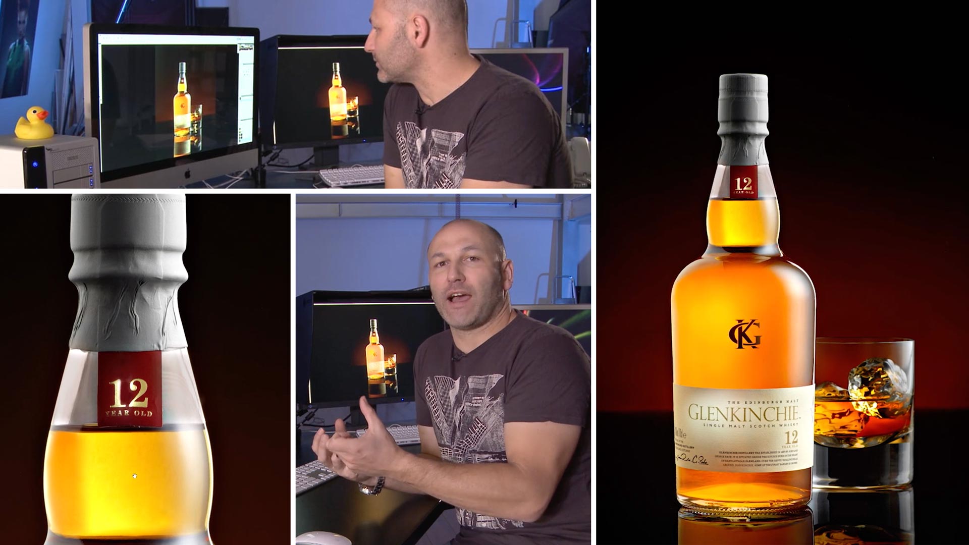
This shot looks simple and effective and the Photoshop work used in this chapter reflects that. Here Karl explains the simple techniques that he used to perfect the image to a level that is professional and good enough for any advertising campaign.
Comments
Hi Karl. Another mind-blowing video, amazing to watch! If I was shooting a branded product for my portfolio, can I use that image on my website to promote my business, even if it wasn’t the brand that instructed/permitted me to take that image? Or should I be shooting non-branded imagery for portfolio work?
Hi Sam, there is no problem shooting branded images and showing them on your site, many top photographers do that and brands don’t mind as long as their products are not made to look bad. What you can’t do is put the brand logo ontop of the image to make it look like an official advert unless it actually was. So for example on my own commercial site you will see images with Boss logos or Karl Lagerfeld on them and I can only do that because that is the context in which they were used for that brands advert.
Hi Karl, I have enjoyed both the BTS and the retouching of the Whisky Product Shot.
What is the size of the black acrylic you are using?
Hi, thanks usually my acrylic sheets are approx 1.2m x 1.2m
In my opinion the bottle looks like it contains honey after this retouching, It seems you managed to capture some opaque liquid that’s not similar to the one in the glass. Is this an industry standard?
Hi Marius, if you take a look at the video you’ll see that this isn’t really retouching, the light through the bottle is the light passing through the glass and the liquid. Often different bottles refract the light differently which can (and the colour of the glass) give a different appearance to the liquid. However a rich gold, yellow to orange colour is common. I’ve shot images for several big whisky companies but I wouldn’t say it’s an industry standard. You can see on this particular companies whisky it’s rich colour https://www.johnniewalker.com/en/our-whisky/johnnie-walker-colours/black-label/ but others on their website are different and you will find that in many different websites. Usually for the advertising in the print/magazines the whisky looks ‘golder’ like in my example because it catches the eye.