


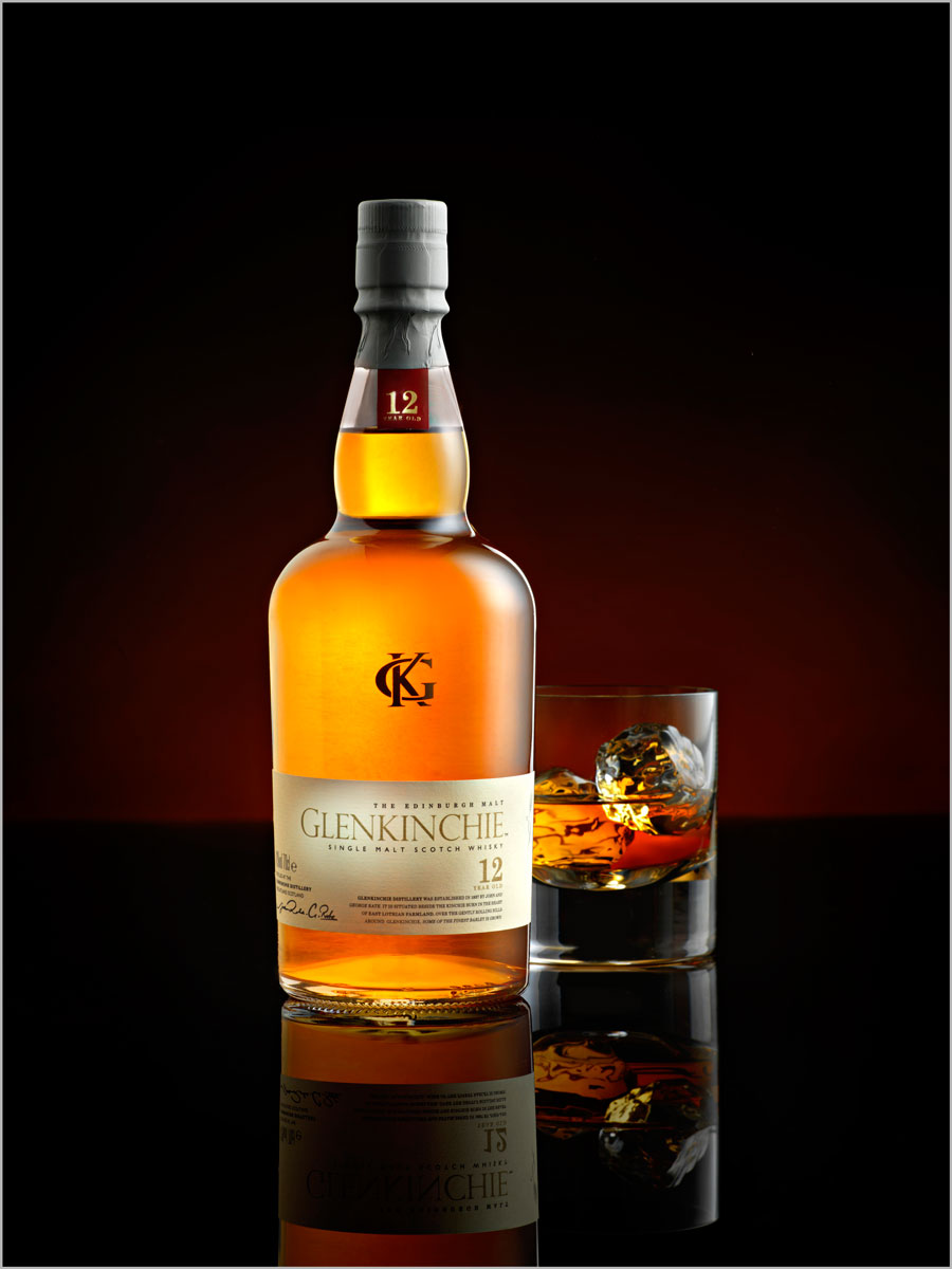
Whisky Product Shoot
You can take pro-quality bottle shots – and here’s the proof…
Glass bottles present a challenge for photographers. But they can be key to successful advertising and product photography careers. The techniques for shooting glass and liquids require a certain discipline and knowledge that, once acquired, will help you understand a variety of other similarly difficult lighting situations.
In this class, Karl outlines the most important things to consider when shooting these subjects, including the lighting on the bottle, the vibrancy of the liquid, and what glass and ice cubes to use.
He also explains why and how to use gradient lighting, how to control reflections in glass, and how to light details like the label.
In this class:
- How to photograph glass bottles
- Lighting setups for beverage photography
- How to create gradient lighting
- Controlling reflections in glass surfaces
- Techniques for lighting liquids
To see how Karl retouches this image, check out Whisky Product Retouching.
If you enjoy this class, you might also like to watch Whisky Photography.
Questions? Please post them in the comments section below.
© Karl Taylor
Comments
Hi Karl, just a small question! When I use the black glossy acrylic it reflects the background color! How did you keep it pure black in this shot not letting of orange color affect it?
Thanks
Hi Marc, the gloss surface will reflect the vertical background more the lower your shooting angle goes. In this example I was not completely low and my orange background was very weak so it didn’t affect it. Take a look at this class to understand and calculate where reflected light will be coming from: https://visualeducation.com/class/angles-of-incidence-and-reflection/
Thanks Karl,
’m going to try this shot soon.
I just want to check something. Do your studio lights have a low enough power setting so that you can pull off the subtle lighting used in this shot? Particularly the background light? Or are you shooting using the modeling lamps?
Hi Will, they usually go low enough unless I’m shooting at f2 or something, in which case I put Neutral Density gels on the lights which you will see me use in other classes.
Great. Thanks Karl.
Hi Karl,
I absolutely love this shot! Any advice where to get the black gloss backdrop? In Uk or online. Thanks
Alice
Hi Alice, you may be able to source some from a local sign makers, I believe Karl has previously purchased acrylic (perspex) sheets from here (UK): https://www.theplasticpeople.co.uk/
Thank you Sara
Hi Alice, if you mean the black gloss surface that is Acrylic or in the USA it’s called plexiglass. All good plastic manufacturers or sign service companies.
I’ve worked on my whiskey shooting several times over.. some of the shots have been excellent in my opinion. I’ve learned a great deal from these tutorials. I have even used fairly subtle light in the background to mimic streams of daylight to add atmosphere. The bottle and glass are quite bright, but I tend to keep it in the realm of realistic. Your example here is bright, but also in the realm of realistic. I was looking at David Lund’s bottle and splash work.. specifically the ones used in beer, whiskey, and whiskey glass/ice pours.. and they are pretty lively and somewhat overly colourful.. beautiful and extraordinary.. I find them quite amazing. But, are less than realistic, or over realistic and super punchy on the colours. There is the photograph supplied.. and then there is the ad. Is it the photographer supplying a realistic image and the ad designer/creative director drifting toward hyper reality or is that the intended target style from the photographer? To me it is as if whiskey has been punched up into a coke ad territory.. super punchy and over emphasized. Am I being too subtle and I need to rethink my presentation?
Hi Gary, this is a very good question but I’d say it comes in and out of fashion for both styles. And it varies between brands. Have a look at Jonathan Knowles, Tal Silverman and other drinks specialists. I shot many whisky adverts years ago and they were more realistic, lately it seems extravagance and dynamics are the order of the day but that could change again.
Hi Karl,
Probably a silly question, but what do you used to keep the black acrylic clean?
I have nearly everything to attempt this type of shot, obviously apart from the fibre-optic cables you used.
I just need to work out how I’m going to like my labels on my bottle of, Gentleman Jack (Jack Daniels). The main label is at the top, and there is a smaller label at the bottom. Any suggestions on how to lite the labels would be very much appreciated.
I only have one snoot, and the top label is quite wide.
Hi James, for keeping the acrylic clean microfibre cloths and methylated spirits. If you don’t have a projection type light then snoots are the way to go, make your own from black card rolled into a cone and try different size openings to get the results you need.
Thank you Karl, that’s very helpful 🙂
Karl, do you ever use optics from other manufacturers with your Hasselblad? If not, do you know of others who use adapters and get comparable results?
Hi Shana, I don’t think there are any alternative lens options for the Hasselblad line up. In 35mm I’ve used Tamron and Sigma as alternatives to Canon lenses. Currently in 35mm I mostly using Sony now and the sony lenses.
Hi Karl and team,
I tried that fake ice cube link and it’s still not working. The only cubes I can find are much smaller, the largest being 30mm (1 3/16″). Would those work or, would they look a bit too small. To me they look like the ice you get from the ice machine at the end of the hotel hallway. Do you know of another source?
Thanks!
Hi, try these people 30mm square should look OK – https://www.thesnowpeople.com/ice-frost-c2/ice-cubes-c98
Hi Karl, I’m wondering about your decision to use the strip softbox horizontally for the background glow. Did it have something to do with the colored gels you wanted to use? I also notice a lot of light spilling out of the sides around the gels. Was that not an issue because of the size of your studio? Why not create the glow in the same way that you did in the tutorial with the model where you used the strobe unit with only the grid or diffusion material over it?
Thank you.
Hi Shana, I was trying to create a wider glow of light so that I could have the paper background further away (meaning background light would be smaller) so that I could make sure the paper was out of focus enough not to show ripples in the paper roll. Now that I use smooth solid backgrounds that is no longer a problem and I can have the background closer and use a smaller modifier as in this example – https://visualeducation.com/class/live-whisky-photography-advertising-shoot/ I hope that explains it. Cheers Karl.
Hi Karl, awesome video. Just wanted to know which of the lights is firing? are they all or do you just have one flash firing and the rest as background light? Thanks
Hi, thank you. They are all firing. This video gives a full explanation on studio lighting – https://visualeducation.com/class/types-of-studio-lighting/
Another awesome video, wonderfully detailed
I can tell that you spent a lot of time trying to problem solve to get the correct highlights working on the bottle and the glass.
I’m curious to know how long the shoot itself took to get all three shots accomplished?
Set up time and shoot time
Hi, thank you. It would normally take me 2 to 3 hours. You can watch me do it live here too – https://visualeducation.com/class/live-whisky-photography-advertising-shoot/
Hey Karl
Absolutely, love this video. I’m so happy that I have discovered your education videos.
Do you have a post-production for this video where you assemble the label?
Thanks in advance,
Todd
Hi Todd, Glad you enjoyed it. Not this one but on many of the other ones we have. There are also newer whisky shoots, one in particular should be in the live shows replay section.
Hi Karl and Team,
I would like to purchase the Lee 216 Full White Filter Material and there are two (2) options here:
– 48″ wide x 25FT roll (1.2M x 7.6M)
– 60″ wide x 25FT roll (1.5M x 7.6M)
Both rolls are the same cost, and I know you’re getting an extra 25 sq.ft. or 2.28 sq.m. with the wider roll, but I am working in a small room. The table I will be using for products is only 0.86m deep. Would the smaller width roll be good enough or would you still opt for the wider roll?
Thanks for your time.
I’d always go bigger as if it’s too big you can trim it down.