
Working to a Brief 11: REVIEW
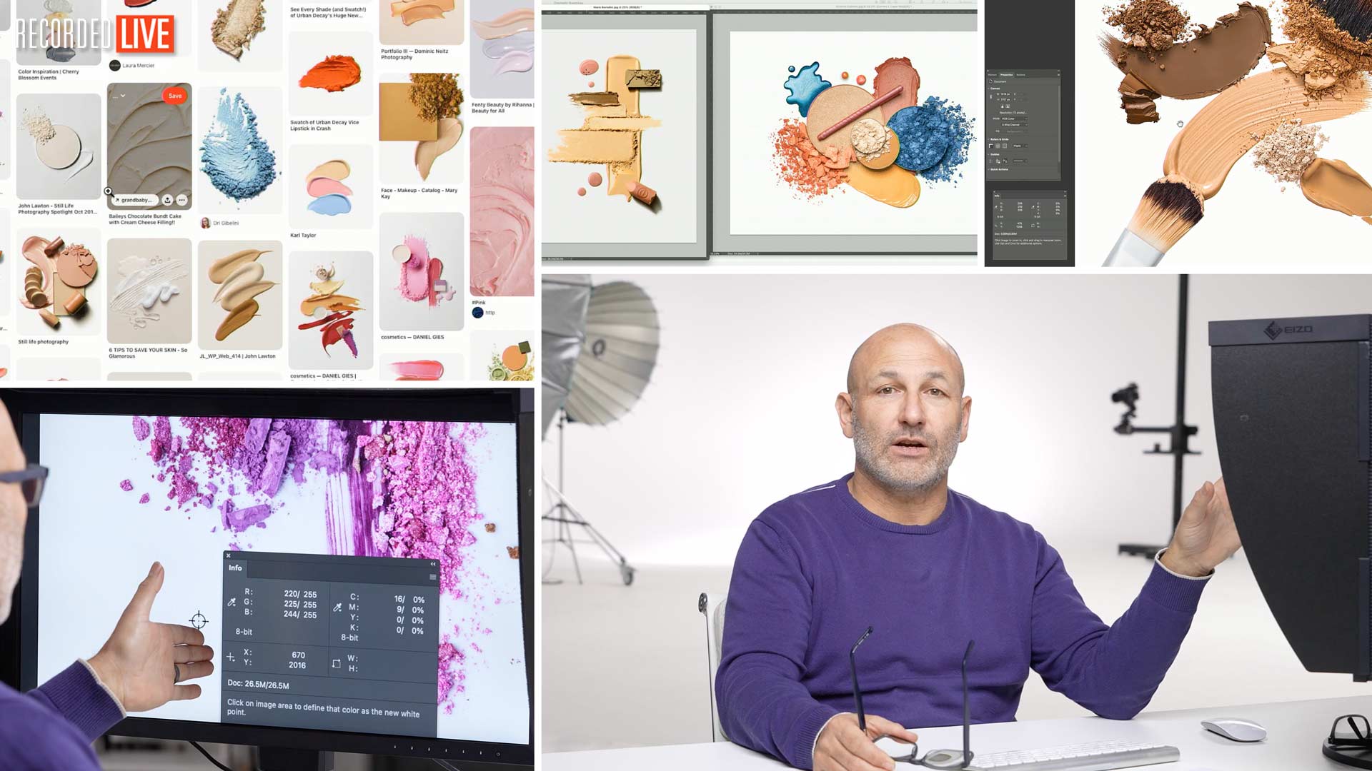
Karl will review every entry for Working to a Brief 11: Cosmetic Swatches, offering constructive criticism and professional advice to help members hone their ability to respond effectively to a commercial-style brief.
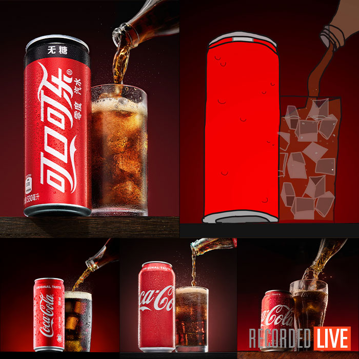
Check out Working to a Brief 11: Members' Gallery to see all the images.
Comments
Hello Karl, and thank you for your kind comments. I have to say, I was very careless about the brief and wish I hadn’t been. I realized my mistake almost as soon as I handed in the image but by then it was too late. If I had tried to submit a different image, both would be disqualified. Therefore, I decided to wait a couple months to take my medicine, and you had it ready.
My mistake was not looking at all of the swatch examples you provided before or during the time I spent arranging the makeup. Instead, I relied on my memory of your video and then allowed my focus to drift after making example after example that didn’t look right to me. I finally had something that I liked, and it did resemble a Pollack painting but by then it was hopelessly off-brief.
Even then, I could have fixed it by simply having another look at your swatch samples. If I had, I would have gone back to my studio and done it again. Instead, after many frustrating attempts to get the makeup to cooperate, I sent it in too quickly.
Lesson learned,
AP
Dear Karl, thank you for your time and valued education, I am a new member, since a few month only and clearly am not a professional. Having watched the replay now, as I have unfortunately missed the live feedback of my photo because it was first up and I came a moment too late – I have to say I don’t understand the feedback at all. Thats not to say that I don’t like the feedback but I literally just don’t get it. How am I going off-brief by creating that face profile? It took me 4 days to get this picture because I had to re-style and re-shoot the entire composition because I first used an eyelash above the eye in the composition, which I then had removed and it screwed my entire picture so I had to redo everything from scratch for the sole purpose of NOT going off-brief as you said not to use any other materials except the actual products itself, liquid, powder and paste. Then seeing you accepting pictures with brushes and lipsticks in them while judging mine to be off-brief is something that I can’t wrap my head around. I stayed 100% within the rules of this brief, I used powder, paste and liquid and produced an appealing image of cosmetic swatches and swirls on a white background, suitable for high-end editorial use… this is my first macro shoot, I never worked manual before and the Lowa lens does not have a correction profile in Lightroom so I send it as is. While I was expecting to be criticised for lighting and sharpness and inconsistent background levels – the last thing I was expecting to hear is that I was going off brief. This is not a rant either, please don’t take this the wrong way but it is paramount for me to understand the limits of my creative decisions, for the upcoming beer brief I will send you the exact replica picture as shown in the brief drawing but for the cosmetic swatches there were no restrictions of how to place a swatch, so as said, I just don’t get it; which is what worries me the most. I have watched the replay 3 times now, its less than one minute out of the 2 hour video and there is not much feedback there to be honest… I would love to hear the issues with the contrast and what to do better, or see you zoom in as on other pictures etc. I guess I was expecting more feedback and mixed with the off-brief comment I am just more confused now than before watching the feedback…
best regards
Alex Lindstrem
P.s.: I am truly sorry for being late to the live stream, I am currently in dubai, mixed up the time zones to Europe and got stuck in traffic as 3pm your time is 7pm rush hour here so I just missed the time when you gave your feedback on the first pic, otherwise I would have addressed these questions live in chat.
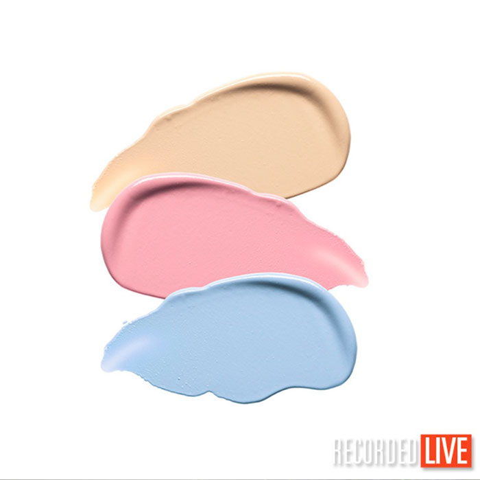
Hi Alex, we provided this pinterest board as mood boards for the brief: https://www.pinterest.com/karltayloreducation/cosmetics-swatches-inspiration/ hopefully you had time to watch the whole show as many of the reasons were explained in relation to other images and also why for example Marco Bertolini’s image was the closest to the brief. Although the concept of your image was clever it wouldn’t have been used in high end editorial for cosmetic swatches because it didn’t provide enough depth or contrast as the lighting was relatively flat. There was no bite to the texture or vibrancy from the materials due to the lighting you used. Please study the Pinterest board and identify comparisons between what you produced and what is on the mood boards. It can be very frustrating to spend a long time developing an image and then feel judged that it hasn’t reached your expectations but I’m afraid the viewer never sees the work that goes into an image and as a photographer you have to appreciate the viewer also doesn’t care how much work went into an image. They will either like it and look at it for longer or they won’t look at it for long. Your image holds a viewers attention because of the face created but not for any other reason and that is why it is not a strong enough image regardless of the work it took you to create it. Take a look at the gallery of images on this page at the bottom where all the images are together as a small collage: https://visualeducation.com/working-to-a-brief-11-members-gallery/ does your image jump out of this collage more than any of the others? Did the critiques I provided on the other images seem appropriate for the reasons I stated? I am excited about the next brief as it will create many challenges and it will be interesting to see what everyone comes up with.
Thank you for taking the time to reply, I do appreciate it. This is actually the feedback that I need “not enough depth and contrast”etc. and perhaps a quick hint of how to counter that. I have completed your LEVELS certification for lighting with 90% (obviously still fail at actual process) and I have tried applying that knowledge, used 4 lights for that shot but I think I know how I failed. I believe the original file had more contrast but my best guess is that I have lost depth and contrast while trying to achieve a more even white background by lighting up the picture in post. Fun fact: at first I used the Karl Taylor light cone (which btw, is absolute insanity that people in Europe have to order it thru B&H in USA, just FYI with Fedex not express oversea shipping, import and duty tax I have paid for the Large version of the cone more than 200 euros(!) total. Anyway, the point is, I had a perfectly good shot using the light cone which is worth every penny even at 200 euros but then I thought, you will see that I cheated with the cone and the light is too even and maybe not enough contrast so I started lighting separately with scrims and harsh spots without the cone. The lipstick has its own optical snoot flash etc.
Long story short, I don’t mind failing, I am here to learn and listen to every word you say and write, and perhaps that can be a problem too, because I read the third line of the brief and apparently took it to serious, the brief literally said and I quote: “No strict guidelines on layout or composition”. Yes, the moodboard shows random samples of smears and shapes… how does that limit me from my smears and shapes forming something when there are no strict guidelines on layout or composition? My shapes and smears just happen to have a purpose. I have heard you say countless times that we should always try and tell a story with a photo, every choice we make should have a purpose… maybe thats not what you expected for this brief but it is exactly what you thought me and I actually love that advise.
Hi Alexander, thank you and let me try to address your points. 4 lights is too much for this type of cosmetic shot, 2 to 3 is about all that was needed please see the classes where we shoot some cosmetic swatches as a reference, in essence higher contrast lighting more directional light is needed but with possibly some global illumination to counter too dark shadows. Yes sorry about the Light Cone we are trying to work on a solution for that to have stock in the UK by March, we will keep everyone updated on this as we go, unfortunately we were under the assumption that our US partner was going to have some EU distribution but that never materialised. The light cone in this instance would only be good for gradient reflections in the glossy liquid cosmetics but may not have given enough contrast elsewhere unless you used the trick of placing black card over the light cone in places. My apologies on the brief blog post where it say ‘no strict guidelines’ although I think in the actual video show where I launched the brief I may have been a bit more precise, I guess I was expecting the mood boards from pinterest to be the main guide. Anyway I think we’ve got a more firm brief for the next one and I’m really looking forward to everyone’s results as there are lots of different challenges in this next one!
Alex, FWIW, my first reaction when I saw your image is that it was off-brief. Mine was too, so you aren’t alone. I didn’t realize I was off brief when I made it but after I sent it in I had another look at the examples and it just about slapped me in the face that Karl was going to say something like, “this is off-brief, next!”
The second thing that crossed my mind is that if you are going to draw a face with the materials, something that immediately takes it off-brief, you should have a skilled artist draw it for you. I actually am a skilled commercial artist and art director and thought of doing exactly what you did. I had confidence I could draw with the makeup to make a stylish and appealing image. However, I realized that if I did that, the focus would be on my drawing, not the makeup. For these swatch shots, you have to be looking at the makeup alone. Anything else confuses the purpose of the shot.
In 2006, I co-founded an academy for artists in the Netherlands and taught there for 12 years. No matter how carefully I described projects, there were always a few students who figured out how to do their work completely within the brief while simulataneously doing something I didn’t want them to do. When I explained this, they sometimes reacted the way you did here, until I figured out that I had to add the instruction, “this is the objective of this project. If you do anything that compromises the objective, even if it is allowed by the project constraints, you are off-brief”.
Karl did something similar by providing all of the swatch examples. I wish I’d looked at those more carefully before I started, instead of barreling ahead all the way to submission.