
Beauty Retouch (Part 1)
In this Photoshop class, where Karl is joined by professional retoucher Viktor Fejes, we look at the initial RAW processing of an image file before commencing further work in Photoshop.
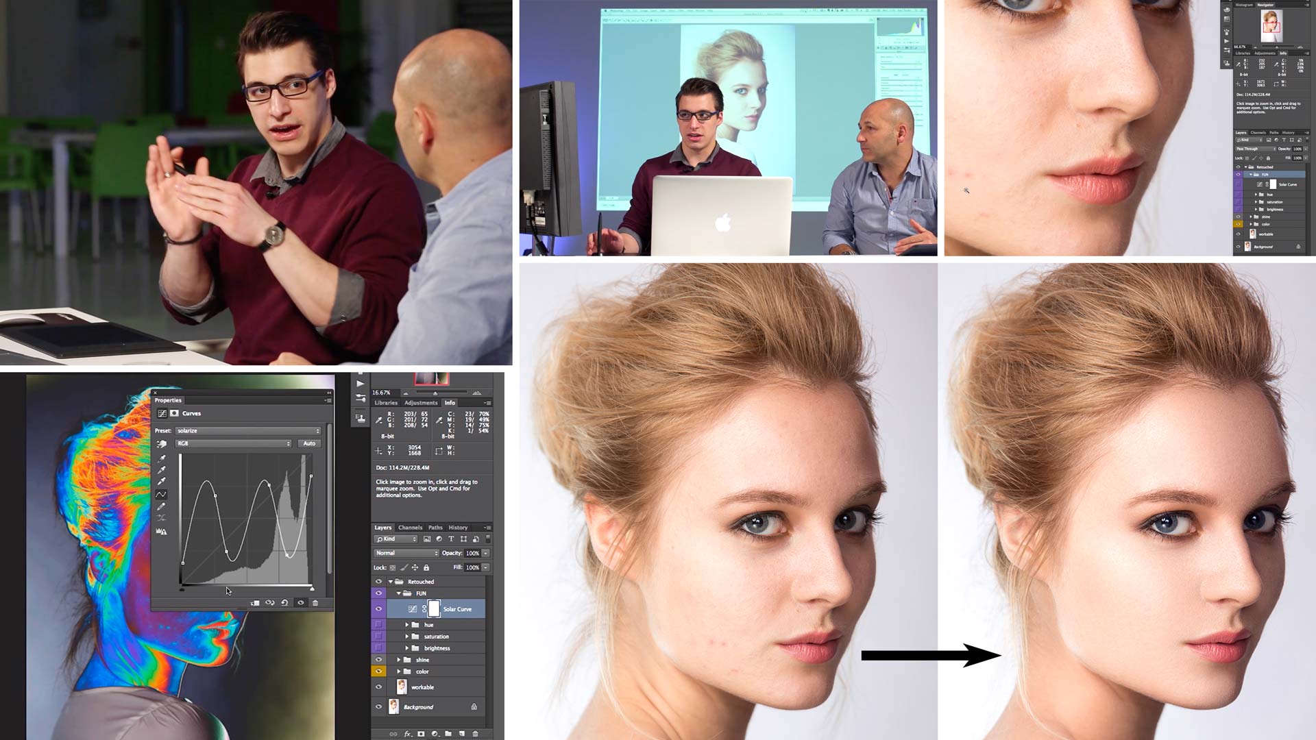
Here, Viktor explains the techniques required for skin retouching and the reasoning behind his retouching process. The pair also explore concepts such as color profiles, visual aid layers and how to optimize your workflow.
Using his visual aid layers (which you can download here), Viktor uses tools such as the Clone Stamp, Healing Brush tool and Burn and Dodge as he clearly demonstrates the initial phases of how to retouch a beauty image. In just a few steps the difference is clearly visible and you’ll be amazed at how effective and versatile just these simple techniques can be.
In this Photoshop class we cover the following:
- How to retouch a beauty image
- How to retouch skin
- Using Visual Aid Layers to retouch skin
- Color profiles: Adobe RGB, sRGB, ProPhoto
- How to fix skin blemishes using the Clone Stamp tool
- How to use Burn and Dodge to retouch skin
- How to optimize your retouching workflow
If you have any questions about this class, please post in the comment section below ?
Comments
It cant log in in some pages!
Hi try clearing your cache and cookies as we’ve recently made some changes on our servers but our tests show all ok.
Hello Karl!
Nice class it is very very helpful, just one question.
Which is the preference of healing brush tool I mean Size, and Spacing. Because I think mine isn’t the same as Victor’s.
And one more question, I have got just iPad, with pencil so I usually do this with mouse, the dodge and burn is a little bit more difficult with this method az Victor said, but is their any opportunity for it with the iPad?
And I have got the newest CC in which I need to do in the brush presets Smoothing too, this will e 0% or sth? 🙂
Thank you very much your help.
Hi Kate, I’m afraid I’ve never tried an Ipad with this so I can’t give you an anwser, maybe one of the other members can help you? For brush I’d always go with soft and vary the size to suit the defect you are healing.
This website is absolutely incredible and easily the best deal in photography education.
I thought about getting a subscription to Photigy, but it was way too expensive and ONLY dealt with product photography so I passed. Your site shows so much more than just product photography and is cheaper. Thank you so much, Karl, you’re an amazing person :).
Oh, I found out about this site through a Facebook ad, if you’re wondering.
Thanks Eric
great video. particularly like the explanation of the brightness layer which i’ll definitely be using in the future. one other question though, who performed the music in the speeded up sections, thanks
Hi Jason, the music is by one of Ben’s (our video editors) friends. He’s on holiday for 10 days I’ll leave a note for him to reply.
Hi Jason the song is Bored by Barnaby. He has a couple of other songs on Apple Music and Spotify as well.
Please could you let me know the brush setting for dodge and burn, for example in the brush settings, shape dynamics, transfer, smoothness and pen pressure.
Hi Jason, I’m running just the default settings, I haven’t changed them.
Is there a particular reason that Viktor select the Type brush shape that he did at 27 minutes, 30 secs and if so what is the name of that Tyle of brush shape?
Hi Gina, at 27:30 Viktor is using the ‘healing brush’ tool instead of the usual ‘spot healing brush’. With the ‘healing brush’ you decide where the sampling comes from (like the clone tool) I guess he just decided that would be better in this instance. I can ask him if you like?
Hi
Where can i download the Action?
Hi Wai, it’s on the ‘downloads’ section.
Hi Karl, how can I start actions? When I click on “The Setup” button, Ps shows so many windows on the screen, not the same on your Mac – click and Ps creates one folder with all things. What I’m doing bad?
Kamil.
Sorry, I got it! It was a bad language, this actions need an English in Ps.
Kamil ^^
Hi Karl just subscribed,the dialogue on skin tone is interesting,if you are interested National Geographic did a feature on Pantone skin tones maybe 2 months back,very interesting
Hi Robert, thanks for joining. I’d be very interested to look at the National Geographic article, was it in the magazine 2 months ago or online? Thanks Karl.
Karl, you should let him talk through his whole process while he dodges and burns, for its valuable to some people. Speeding it up actually takes away from the learning process.
Hi Linh, as this the ‘advanced’ course we speeded up what we felt was already covered clearly in the ‘photoshop for photographers’ course.
where can i download the macro function that he used in the demo ?
Hi Eddie, in the downloads section.
Fabulous class. but i didn’t get how to make that layers Which are used to do all the adjustment. in starting of the video you mention that this will teach later but i am not able to find out in which chapter you explain about that
Hi Vishvas, that comes in Chapter 6 at about 3mins in to the video and there is also the download for the ‘actions’ file to create them automatically.
Changing color spaces does not change file size. Take a photo into Photoshop in one of the three spaces. Now convert. The file size will stay the same. The size of a non-layered file is determined by the image size, mode (color or bw), and the bit depth.
A file with a given bit depth will have the same number of colors in each space but the colors will be limited to what is in the color space. For example, the ProPhoto space is huge, which means that it contains colors that a smaller space cannot, mostly in very saturated or neon colors, but since the a large gamut space and a small gamut space have the same number of colors, as determined by the bit depth, the steps between colors in the large space is greater than the steps between colors in the smaller space, as the same number of steps have to cover a greater area.
So when determining what color space to use, you want a space that just big enough to contain the colors you’d like, but not so big as to make the steps between colors too big, although this is more of a problem with 8-bit-per-channel images than 16-bit.
Thus, if the image is only going to be on the web, which is sRGB, working in sRGB makes sense, but if one is going to print, where the printing process might be able to print colors outside of the sRGB gamut, and the image has those colors, then a bigger space should be used.
Adobe 1998 is a nice middle ground, and is usually the best choice, unless one is working with neon colors.
Hi Karl and Ben,
All looks in sync now 🙂
That’s got to be some kind of record for sorting out an issue, very impressed.
Thank you.
Very interesting course so far, I really love the visual aid layers.
Note: Audio appears to go out of sync from 28:45.
Hi Mark, thank you we’ll look into that and if it is a problem we will replace the video, it may just be a streaming error but we’ll check. Thank you.
Right thats all sorted, there was an error in the upload, should be playing fine now, thanks for the heads up Mark